10,000 search results (0.01 seconds)
  1. Han Zi by ParaType, $25.00
    The display typeface that is based on the shapes of traditional Chinese hieroglyphic characters. Designing the font for imitations in the Chinese style the author nevertheless demonstrates serious attitude and thoroughness using the table of keys of the regular Kaishu script. As a result the font looks stylistically authentic and genuine. The typeface was designed by Aleksandra Egorova, the young type designer from St. Petersburg, and released by ParaType in 2008 .
  2. DNA ad - Unknown license
  3. Ad Words by Outside the Line, $19.00
    Just in time for the sale season. Ad Words is a font of words you would use if you did retail ads. Some words in script, some print, some bold, some not. Plus 2 starbursts. Enlarge the starbursts and then reverse one of the words out of it… like Now! Win! or Free! Other Outside the Line fonts work with this one, check out Architectural Lettering Regular and Bold, Plz Print or Plz Script.
  4. Ad Lib by Bitstream, $29.99
    Designed for informal effects in 1961 by Freeman Craw for ATF.
  5. Ad Astra by Scriptorium, $12.00
    An original dingbat font with a science fiction theme.
  6. Ad Lib by SoftMaker, $15.99
    Ad Lib was created by Freeman Craw for ATF in 1961. Sporting irregular character shapes, this informal typeface makes a good impression when a 1960s look is desired in advertising and display work.
  7. Ad Lib by Image Club, $29.99
    Ad Lib designed by Freeman Craw for the American Type Founders (ATF) in 1961. A bold Grotesque with irregular rectangular counters in round characters. This type was designed by cutting the letter images out and thus has some wood-cut character. Some lower case characters have slight inclination. Initially numerous alternative characters were provided. Unusual shapes make this typeface useful for advertising and display work.
  8. Ad Hoc by Linotype, $29.99
    Ad Hoc is a fake. My intention was to design a typeface with the looks of the characters drawn on paper with a marker pen. But they are all drawn on a monitor, with no scanner ever involved. That's the reason why they look so regular. Ad Hoc is Latin and stands for, approximately, for this reason". The expression itself is often used for something unplanned, improvised. Ad Hoc was released in 1992.
  9. PR8 London Ads - Unknown license
  10. Bodoni Classic Ad by Wiescher Design, $55.00
    I became interested in designing Bodoni Classic because of a lazy graphic designer at Jacques Damase publishing house. He had to change a single letter on a bookcover about J. B. BODONI. The French call him Jean Baptiste instead of Giambattista! And that unknown graphic designer just took any old “J” from some newly cut Bodoni. All the new Bodoni cuts have square serifs, whereas the originals had rounded serifs and slightly concave feet. The single letter “J” with the squared off serif was for me like a road sign to start redesigning the entire Bodoni family. That’s exactly what I started in 1993 and a dozen years later I am finished. Okay, I am still adding new Bodoni Classics, but those are my personal additions. Yours very retro, Gert Wiescher
  11. DR Ad Astra by Darumo, $15.00
    Enjoy this sophisticated serif font. Modern trends finally meet timeless classics here. This typeface, wherever it's used, will give a sense of refinement in detail, and at the same time, a touch of relaxed elegance. If you are looking for a trendy font that could give you these feelings of modern grace and classic elegance, you've already found it. This font is quite versatile and can be used in both classic and modern designs. Whether it's a sensuous Jane Austen-inspired love letter or a trendy acid-jazz concert poster, this font will give your design a finished look and a touch of sophistication.
  12. Ad Lib WGL by Bitstream, $50.99
  13. Architype AD 2014 by DePlictis Types, $31.00
    Inspired from archaic slavonic calligraphy, with a modern, fresh and spontaneous look, Architype AD-2014 is a display font designed for impactful and original headlines that has somehow to do with historical or religious content.
  14. One Ton by Luke Thompson, $10.00
    One Ton is a really chunky stencil face that sticks to some strict rules, giving it a distinctively industrial, angular look. It's designed so that the spaces between characters all align in a strong grid. It can bring a ton of personality to signage, branding, editorial and packaging projects where you can afford to be a bit experimental.
  15. ADs Comics For All by Letters by Amal Desai, $10.00
    AD's Comics For All has everything you need from a professional comic book font but with a light, accessible price tag. The key to digitally lettering comics is mimicking the style and natural imperfections of hand lettering. This font was handmade and programmed (with nifty tricks) keeping exactly that in mind. The functionality of hand lettered comic book fonts definitely doesn't end at comic books. It can give an energetic and natural feel to just about any design. They can be especially handy when a bit of contrast is needed in a type-heavy layout. If you need an exceptional and affordable font to letter your indie comic book/manga/graphic novel, AD's Comics For All is an excellent choice. If you're a seasoned letterer, this versatile font is worth adding to your dialogue arsenal. If you're a designer and have never looked twice at a comic book, you'll find that comic book fonts are a category of their own and a useful tool in your utility belt.
  16. Deco Film Ad JNL by Jeff Levine, $29.00
    A ìthick and thinî Art Deco sans lettering design was found within the pages of the May, 1936 issue of Modern Screen magazine. This condensed typeface has rounded terminals, similar to that made by a round nib lettering pen. This is now available as Deco Film Ad JNL in both regular and oblique versions.
  17. Movie Ad Deco JNL by Jeff Levine, $29.00
    An extra-bold, hand lettered type design with a casual feel was used for the 1942 movie poster “Tortilla Flat”. This served as the inspirational model for Movie Ad Deco JNL, and is available in both regular and oblique versions.
  18. Music Ad Stencil JNL by Jeff Levine, $29.00
    An ad appearing in the January 5, 1952 edition of Billboard Magazine promoted the then-new releases from Capitol Records. The headline copy was set in a bold, condensed sans serif stencil typeface. This inspired Music Ad Stencil JNL, which is available in both regular and oblique versions.
  19. One Trick Pony - Unknown license
  20. Jon - Unknown license
  21. ion - Unknown license
  22. POP - Unknown license
  23. Pod by Device, $29.00
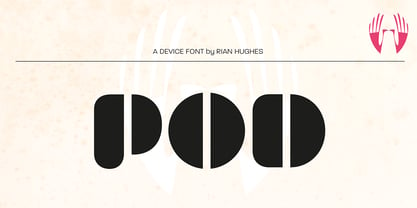
  24. Ron by Brainware Graphic, $12.00
    Ron is a vintage medium block typeface, a classic and bold display font with a cool vibe. Use it to add a smart feel to any design project.
  25. Pop by Alias Collection, $60.00
    A decorative, maze-like multi-line typeface in two weights. Lower case is narrow, upper case is wide, the two can be mixed to give a variety of bold, dynamic effects.
  26. Ponte by SilkType, $47.50
    Ponte is a high-contrast display typeface with smooth serifs, designed for impactful headlines. The ten-style typeface features over 80 decorative ligatures, with roman and italics available in five weights, ranging from extra light to bold. This offers a variety of options for sophisticated design applications. Elevate your compositions with Ponte's timeless elegance and aesthetic precision.
  27. Bonning by Greater Albion Typefounders, $8.95
    Bonning is a Roman face full of the spirit of the 1920s. It was inspired by a (real)estate agent's For Sale board seen in an old sepia photograph from that era and combines visual flair and period with good clear legibility. A range of Opentype features including alternate forms, old style numbers and fractions, as well as discretionary and standard ligatures are included. Three weights are offered, including a shadowed black form are offered, all in a choice of three widths. It's the ideal face for signage with a period feel, as well as posters, headings and feature paragraphs.
  28. Pod by kapitza, $49.00
    Pod™ is a cute foliage font consisting of 62 illustrations. It is entirely hand drawn and each character is unique. When combined it is easy to create fantasy forests and magical meadows.
  29. Don by T-26, $19.00
  30. Ton by Katatrad, $22.00
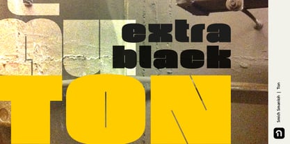
  31. Silly Poo-Poo - Unknown license
  32. VLNL Bon Bon by VetteLetters, $35.00
    Exuberantly delicious and lusciously sweet! VLNL Bon Bon embodies the perfect after dinner treat. Chocolate is a known aphrodisiac and bonbons are its most romantic carrier. Bonbon is not for nothing the French word for ‘good’ twice! You could definitely consider VLNL Bonbon the typographic equivalent of these exquisite chocolate sweets. Inspired by lettering on an Amsterdam church facade and a ladies clothing store window, Donald DBXL Beekman started drawing the first incarnation of Bon Bon already in 2004. The original idea was an alphabet design with slanted oval inner shapes and extremely long and striking serifs. This proved to be a quite demanding design job, so It took Bon Bon some time to get finished. But now it’s here in all its extravagant glory. Most recently a number of lowercase characters were added to make Bon Bon more versatile. Totally insane and over-top-the-top it has been called. But hey, we all love Bon Bon. Don't we?
  33. Candy Pop! - Personal use only
  34. Calligraphy Pen - Personal use only
  35. Don Quixote - Personal use only
  36. Pop Warner - 100% free
  37. Jon Handwriting - Unknown license
  38. FD Pops - 100% free
  39. BON ViVER - Unknown license
  40. Café Pop - Unknown license
Looking for more fonts? Check out our New, Sans, Script, Handwriting fonts or Categories
abstract fontscontact usprivacy policyweb font generator
Processing